
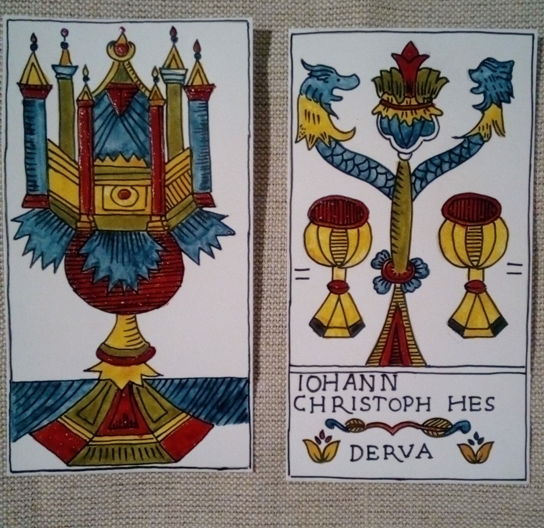
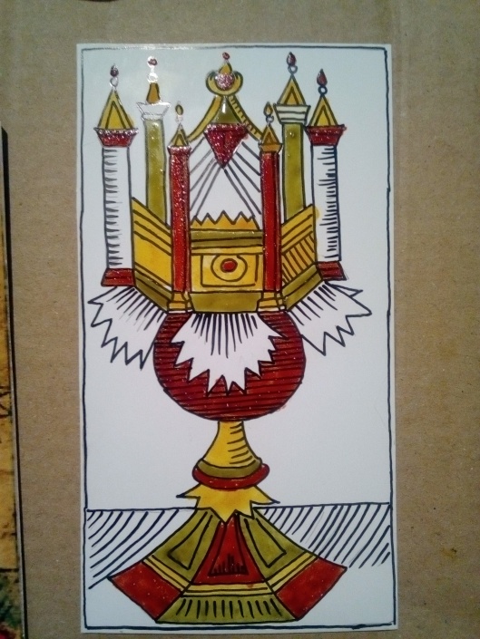
You can read more about the Cups in the Hes – Derua Tarot here.
About the making I wrote as well..
About the black and white drawings…..
Have a nice day.
About the re-creation process of my favourite Marseille, The Hes Tarot
You can read more about the Cups in the Hes – Derua Tarot here.
About the making I wrote as well..
About the black and white drawings…..
Have a nice day.
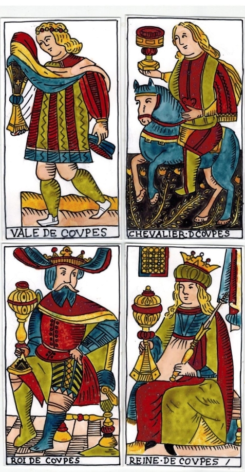
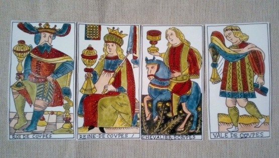
I have finished the Court card in the Cups suit…. not a really good photo, the reds are too shiny
Some other photos made during the making…..


I had some difficult decisions to make about the colours. I decided to colour all the “skin surfaces” with a light pinkish-brownish shade, and some of the other patches also, this is the way of colouring in the Conver deck as well. I did not colour the King’s hair green – my colour scheme I try to stick to would advise me to do so, but I could not bring myself to do it:). … But I colored His boots in two different colours as in the original:). Another interesting thing is that the sleeve on the Page’s right arm is left uncolored in the original, so I did the same.
I will post the whole Cups suit in the next post ….. and the next step will be the first seven Major Arcana cards:)
Have a nice day.
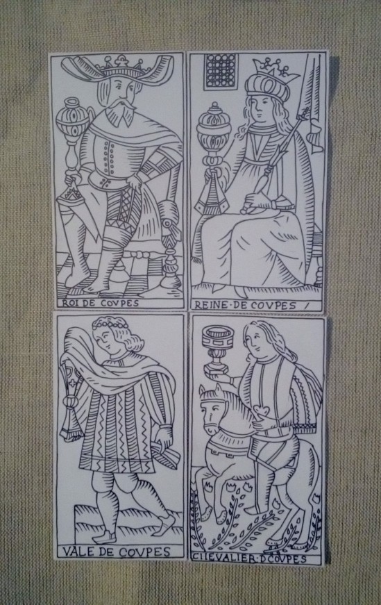
The four court cards in the suit of the cups yet uncoloured ….and the different “conversations” between them:)


Maybe you have already noticed, that in the page title the letter T is missing, like in the original Hes deck. About the I instead of Y (King and Queen) I have already written in other posts…..
Have a nice day
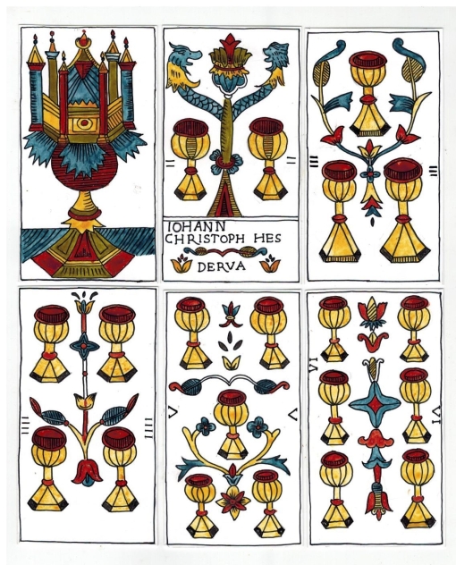
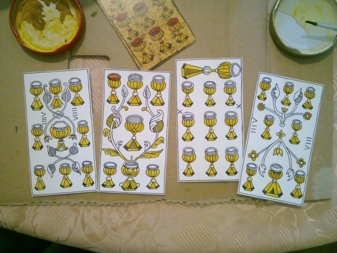
The coloured cards in the suit of Cups without the Courts……

One tiny piece is left uncolored, I will do it later…
Have a nice day!

Yellow and red colours …these photos are about the colouring process of the Cup cards using plant based paints….


In the next photo of the Ace of Cups the green paint is just drying….
… as in the next photo about the Two of Cups.

In the photos you can see that the red colour is very shiny , it is because I put too much gummi arabicum in the paint, so it got too sticky. It is not easy to paint with either, because of the same reason: I have to paint the red patches in several layers…
Next time I post the – almost – entiry suit of Cups with all the colours.
Have a nice day, or evening:).
She is a really great help….

I usually start working on the cards at 3 or 4 a. m. with Triskelion on my lap purring me into a meditative state…. so I do not get up and disturb her napping:). This helps me to do a lot of painting and drawing till 6 or 7 a. m. when we get some breakfast…
The same with blogging… although she could nap in a more comfortable place and position she does not leave until breakfast time…
Next time I will post some photos about the different phases of the painting process…
Have a nice day!

Now that I am writing this post some of the cards are already coloured – and they look like real Marseille cards:).
But let us go through some of the interesting details… the two of cups was for me a puzzle for a while, than I checked the original photos, and realized that what seemed to be teeth in reality is the texture of the aged card. So the “monster” , – originally meant to be dolphins? , – got no sharp teeth on my cards after all:).
The Seven of Cups is not numbered, and has three bigger cups where the red liquid in the cups at the bottom and the top is rather in the upper part of the cups. I am not sure how to colour them, because in the upper part we can see the lines, but the lower part is blackish as well , so at the moment I am not able to work out what was the reason for it – maybe a colouring mistake on the original card?
On the Seven of Cups of the Hes Tarot is a cross on the cup in the middle of the card.
The numbers on the Eight and the Nine of Cups are interesting – one of the numbers is depicted like the standard roman numerals, but the other is not. Till now it is a mistery to me… I have no idea why they did it in this way. In my opinion, we can see the work of two different hands in the Hes Tarot deck. The person who carved the court cards and the Major Arcana is not identical with the one who carved the pip cards. The pip cards are made in a more crude manner, maybe that is a reason for the impossible roman numerals?
Next time I am going to post the coloured suit of cups.
Have a nice day.
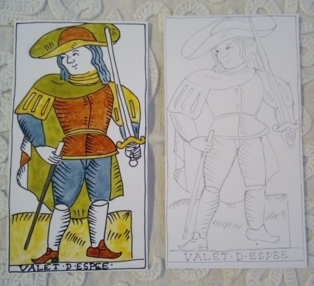
My pen arrived at last. So this is a first version of the Page of Swords , with bolder lines, and my plant based paints. The black colour I have not written about earlier comes from soot, which is not an easy paint to deal with, maybe because of the high fat content. Maybe nut or nutgall and iron would be better…. On this card I did not painted the face, hands, the inner side of the cloak, – at least , the lower part seems to be the same shade as the page’s face – and the stockings. All these parts of the card are painted in the original a slight brownish-pink shade. I decided doing it after I have coloured all the cards with the other colours. I think I have to postpone my decision, because I am really not sure….

The next photo is about the two versions of the Page of Swords. My first version , I have already coloured depicts a Page of Swords, not really typical for the this card. With this face he is a rather a Page of Cups:) Anyway , I like him. …The card on the right is my new version , much closer to the original Page of Swords in the Hes deck.
Have a nice day.
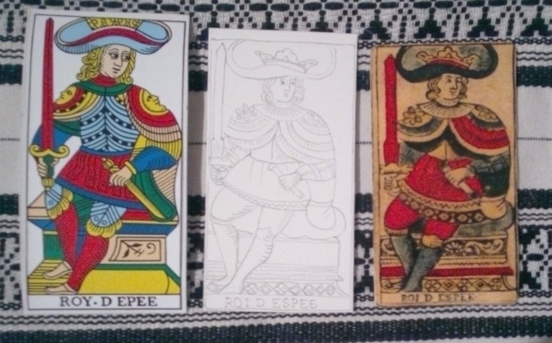
My last post was about the Hes-Queens…. This time I would like to write about the Kings in the Hes Tarot.
The Conver King of Swords holds a scepter in his left hand, in the Hes King’s hand there seems to be rather a rolled document. This is my best copy among the Kings, I think.
The King’s crown on the Hes card is not only partially depicted in comparison to the Conver card. On the shoulders there are plates with flowers not with faces, on his right shoulder the flower emerges from the piece of clothing like a real plant. Again the flower pattern on the base of the throne is more elaborate than on the Conver card.
Generally speaking we can state that on the Hes cards the clothes and props are depicted mostly in a more sophisticated way, but nature in the background of the cards is represented more poorly – in contrast to the Conver deck. Finally I would like to mention that the title of the card in the Hes deck, similarly to the Queens, is written with I instead of Y.
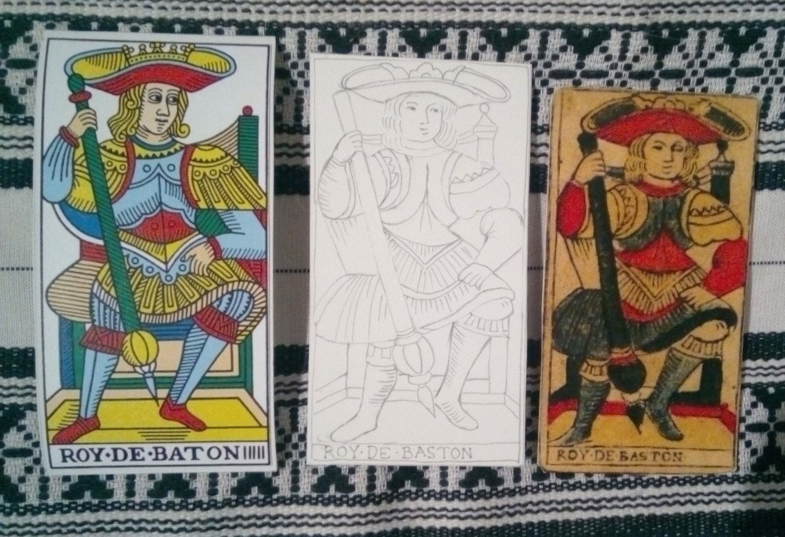
King of Batons…. not many differences, maybe just one : the “skirt” of the Hes King covers his throne entirely, whereas on the left of the Conver card there is an undefinable something, maybe the seat.
The melancholic Hes King looks younger, than the Conver King of Cups. The intricate ground design on the Conver card is replaced with a simple checkered pattern.

I really like the expression of the Hes King of Coins, especially his moustache:).
Their hats and hands are different.
The ground is depicted rather plainly in comparison to the Conver deck.
The title is with I again.

Somehow I have the feeling that the creator of the Hes cards just tried to interpret the blurred parts of an earlier Marseille deck… this is an attempt of translation. This gave him a certain freedom that maybe suited very well to his temperament:). All translations are interpretations at the same time … and I think this one is a most interesting addition to the Marseille language, a practical and down-to-earth dialect.
Have a nice day.
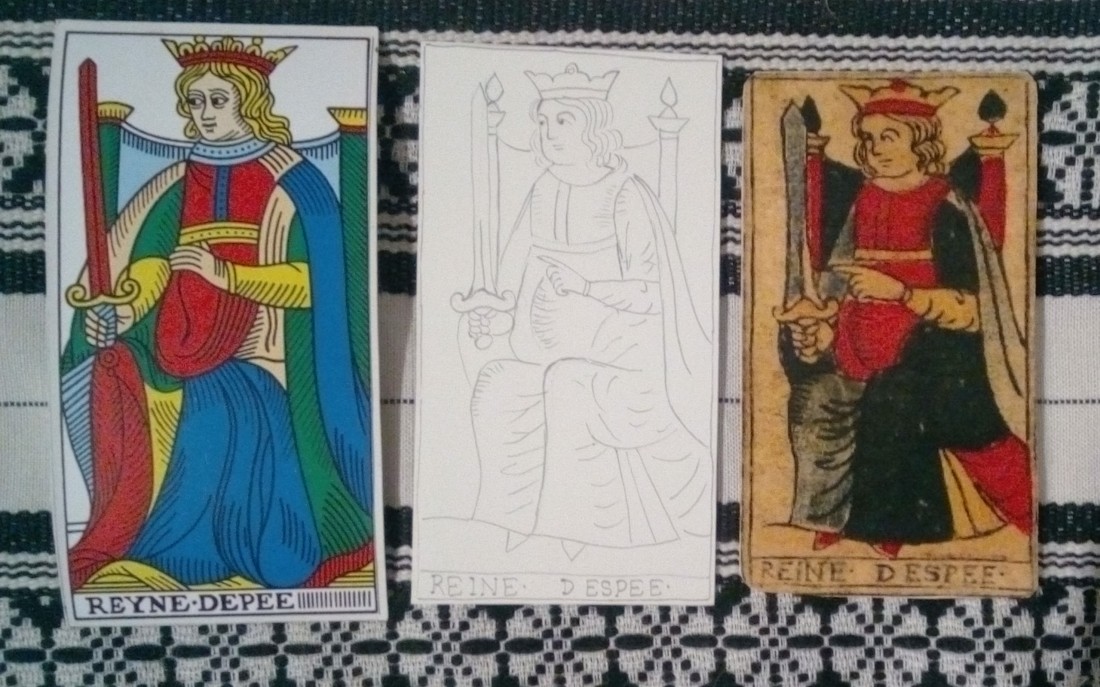
Here are my queens…. there are some subtle differences worth looking at. A generally found difference is in the spelling: the German card-maker used I instead of Y in all the queen-cards. But there are others as well. In contrast to the Conver image, where the Queen of Swords actually places her hand under her heart, as if she was pregnant, the Hes Queen of Swords points to the Sword itself.
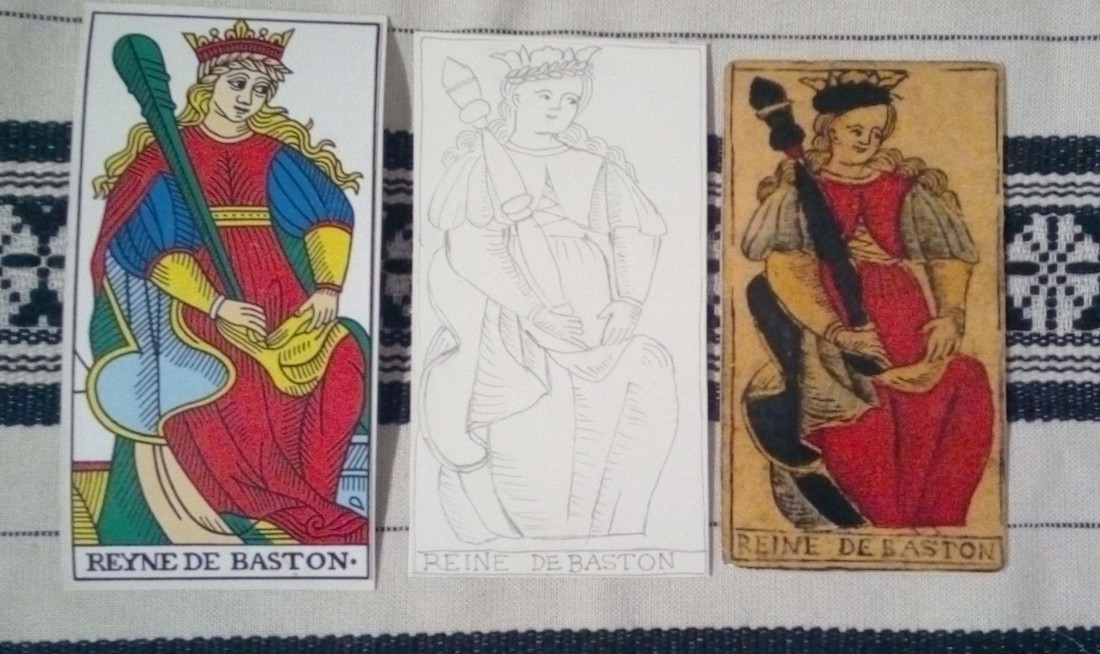
The Queen of Batons in the Hes deck makes up for this, actually:). She places her left hand on her belly and not on her clothes as in the Conver image. The tree-image on the Conver card is missing in our card. If you want to be very symbolic, you could say that it is not a big difference, since the tree was replaced with the snake:).
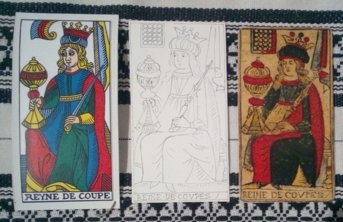
On the Hes Queen of Cups we have a window instead of the funny looking textile over the Queen’s head…. I leave to you the interpretation of this detail…
The main difference for me in the Queens of Coins is the lower brow of the Hes-Queen, and you cannot see her crown entirely. Another thing is the strange part of clothing on the right leg.

Well I am sure you are able to detect much more interesting differences…. It is always a good exercise to compare the images in different Marseille decks, it teaches us to notice seemingly unimportant details – not only in cards, but in our life as well, – and improves our interpretation skills too.
Have a nice day!
